The Kitchen
1 brief 2 rules of the world 3 world building concepts 4 the kitchen 5 the rotunda 6 the city 7 buena vida 8 the market 9 transportCrafting the London of tomorrow for Netflix
Brief
Crafting the London of tomorrow.
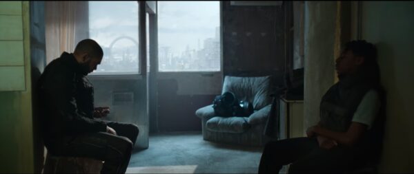
In a dystopian future London where all social housing has been eliminated, Izi and Benji fight to navigate the world as residents of The Kitchen, a community that refuses to abandon their home.
The Kitchen was 10 years in the making. Factory Fifteen Director Kibwe Tavares and Actor Daniel Kaluuya’s success with our early short film Jonah made the pair want to team up for a feature. With DMC’s Daniel Emmerson in Production and eventually Netflix’s backing, we are here; watch The Kitchen on Netflix NOW!
The Kitchen, like all feature films, was a huge collaborative effort. Our multi-layered role involved Kibwe Tavares as Co-Director, Jonathan Gales as VFX Creative Director, and our wider studio in concept design and 3D / 2D VFX asset production. This page showcases our studio’s contribution in Worldbuilding, contextualizing our work within the final film.
For press inquiries for The Kitchen please contact press@factoryfifteen.com
THE MOST GRIPPING dystopias are the ones that feel alarmingly close to reality, offering a glimpse into a future we’ll soon inhabit.
Rolling Stone
Rules of the world
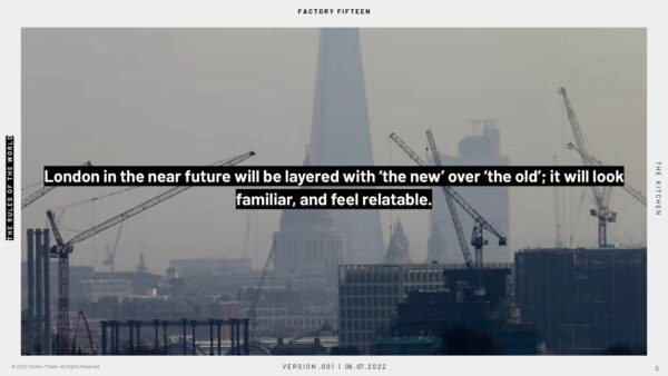
London in the near future will be layered with ‘the new’ over ‘the old’; it should look familiar, and feel relatable.
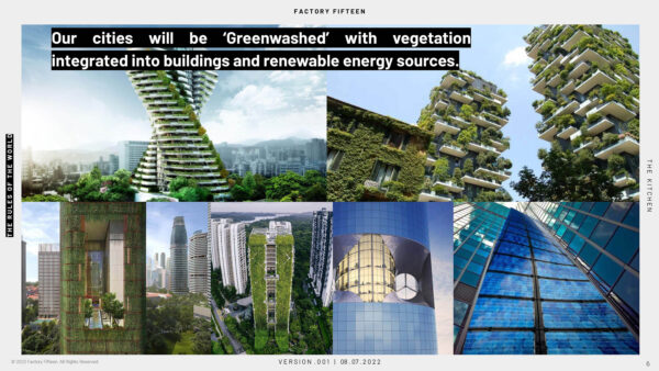
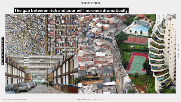
Jonathan Gales led an initial investigative research-based concept phase where we had to ask ourselves beyond the architecture, how people inhabit this space. Transport, technology and themes to represent the increasing divide between the rich and the poor. Where social housing has been entirely eradicated and central London has been greenwashed.
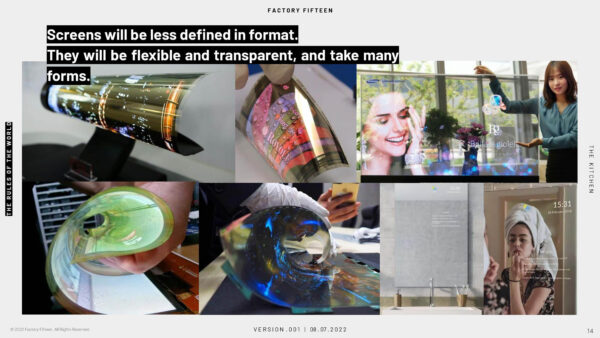
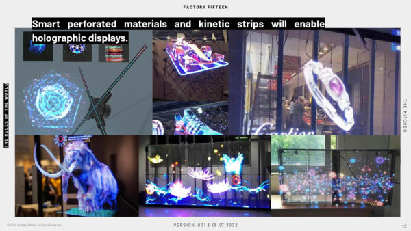
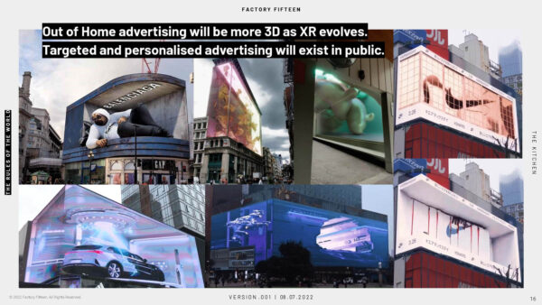
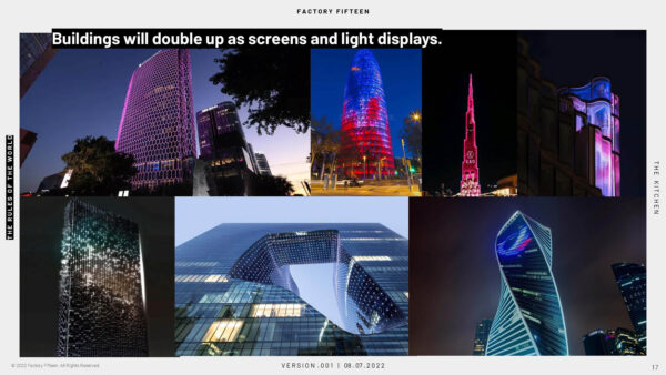
What jobs do people have in this future? How are people getting around? How is information from the media and advertising represented? We wrote a timeline and ‘bible’ to better help focus and synthesise these concepts to communicate with the rest of the crew and investors for what this world could represent.
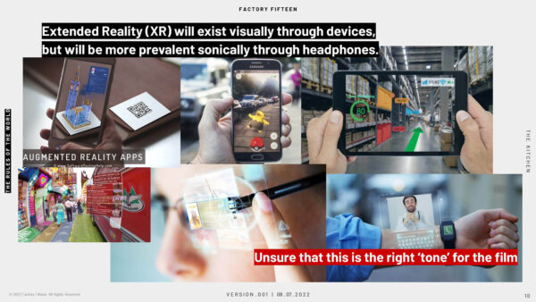
World Building Concepts
World Building Concepts
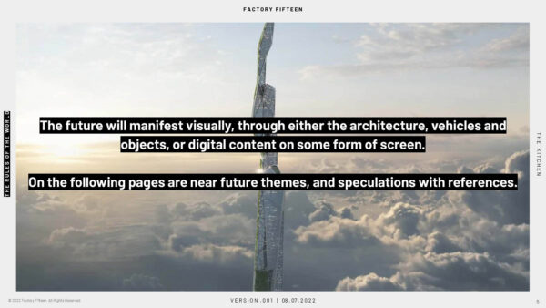
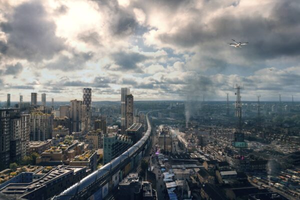
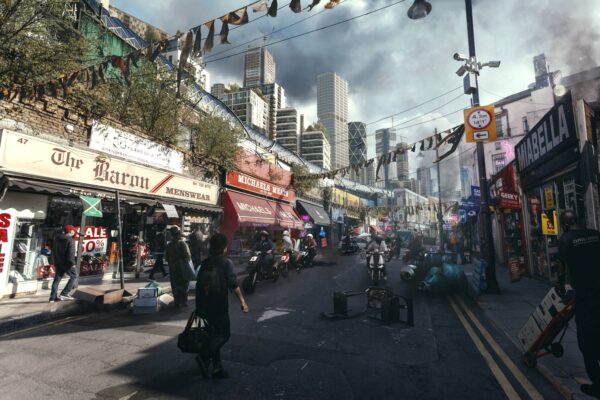
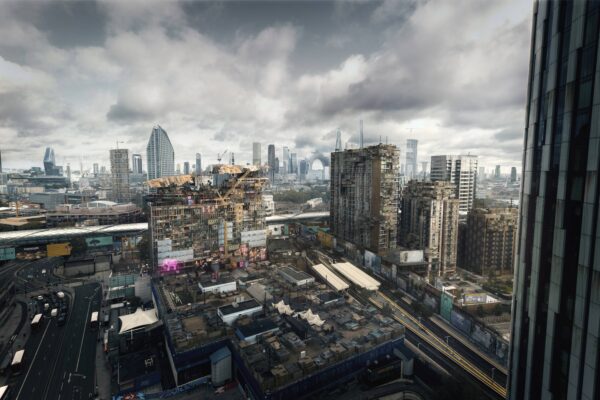
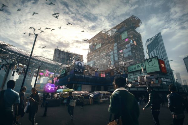
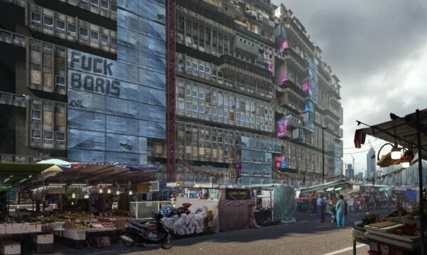
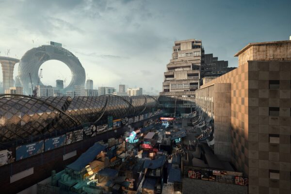
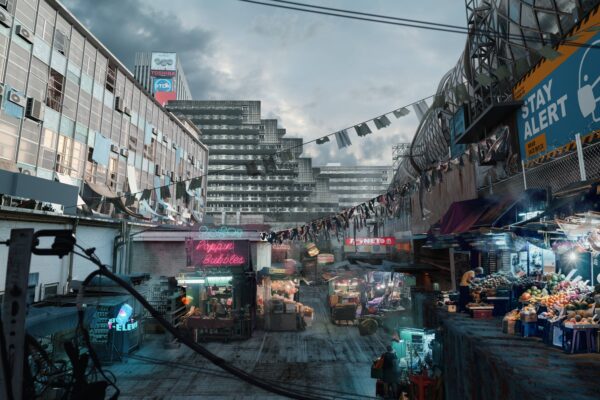
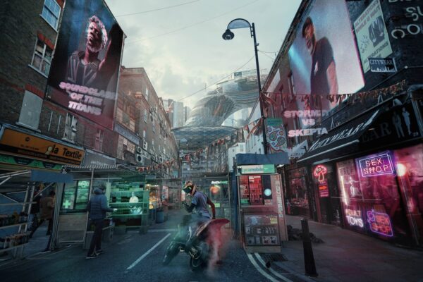
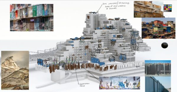
We set out several years ago to create a series of concept imagery to help further convey these ideas of the World, focusing on showcasing imagery around the Kitchen and it’s relationship to the City.
Key ideas around utilising a modern monorail service to create a physical barrier to those displaced from their housing to outer boroughs of London, preserving the centre as a cleansed utopia.
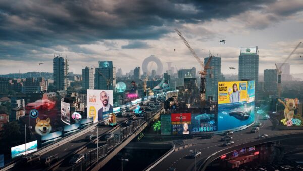
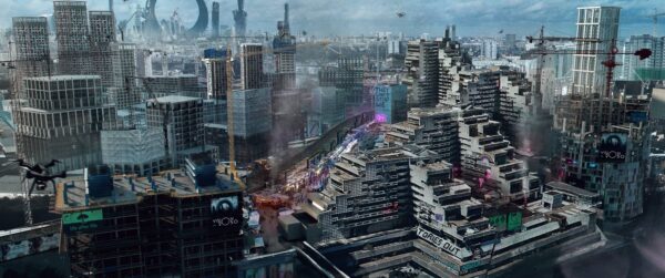
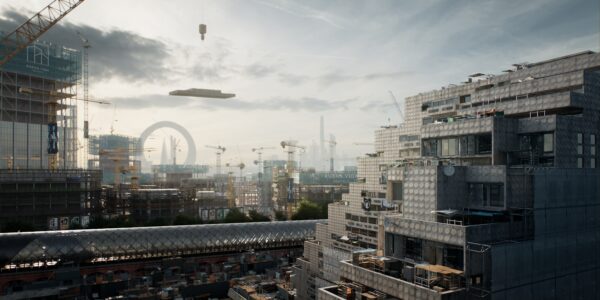
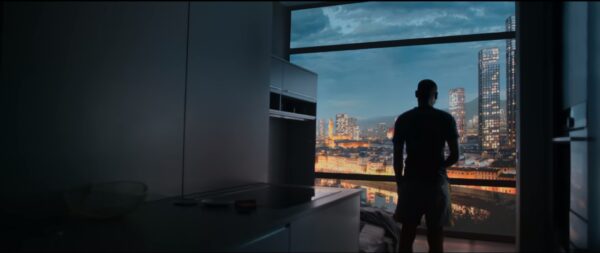
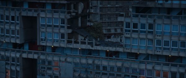
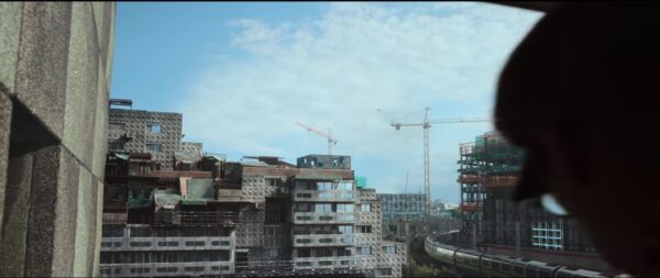
Testing familiar locations across London already battling pressures of gentrification; Brixton, Elephant and Castle, Bethnal Green to push them that much further over the edge. Towering sanitised highrise blocks juxtaposed against the existing community and social fabric trying to stay together. Glass and steel versus a tapestry of life. The idea that the City should always feel present in views from the Kitchen: imposing. A secondary silent antagonist to the prominent police presence shown in the film.
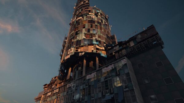
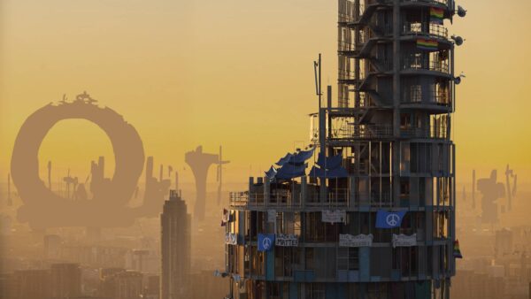
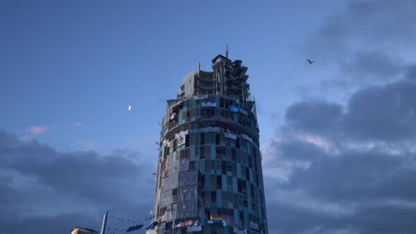
The Kitchen
A community. A home. A shithole.
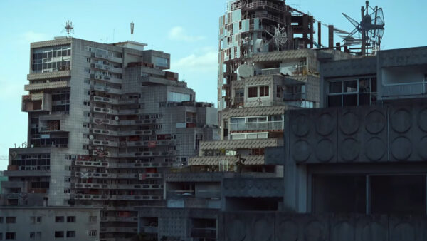
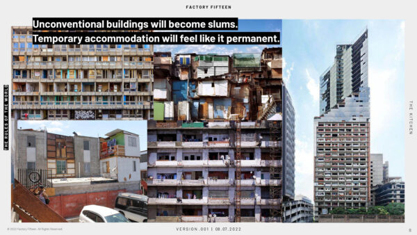
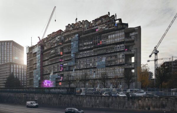
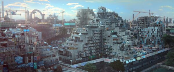
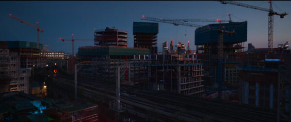
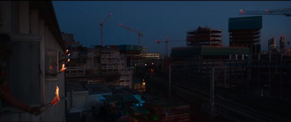
A key idea we had to resolve was the relative geolocation within London. Was it the last standing bastion amongst new builds, closing in around it at the centre, refusing to bow out? Or simply another abandoned construction project in a sea of other similarly failed schemes in the far outer reaches of London, the City skyline a distant dot as a reminder of home?
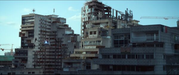
We generated many sketches and tests on how this relationship could look, utilising the existing railway line to cut the image in two halves, settling finally on marrying these concepts to create a larger scale to the Kitchen of part finished buildings while retaining an exaggerated form of the city to be still prominent within the views.
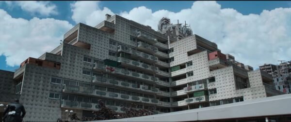
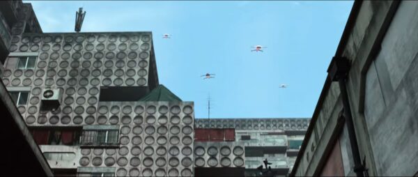
At the micro level we wanted to explore how people would customise their homes and make use of these incomplete shells, adding props and even new temporary makeshift facades to buildings to form a natural bric-a-brac pattern, breaking out of the conventional 90 degree angles of the new construction.

The Rotunda
The Rotunda
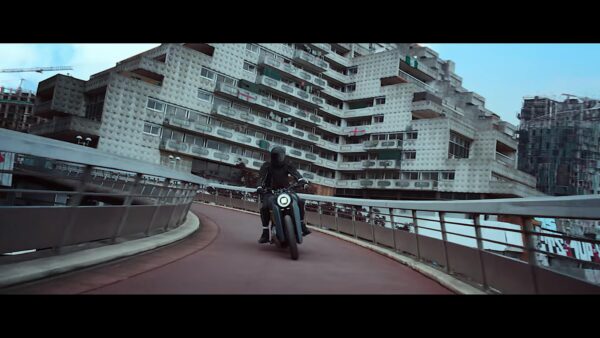
Home to Izi, we designed the exterior shell to marry against the interior of the set at Collins Music Hall, copying the same language through to also design several further interior floors. The brutalist interior of the slabs, turned into a home through the residents personal effects and painted walls and objects.
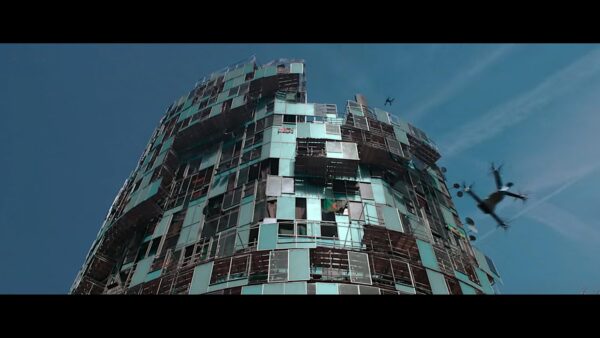
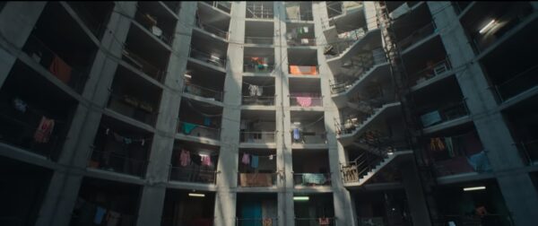
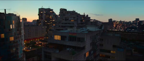
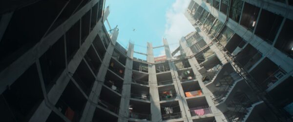
The epicness in The Kitchen comes especially from the fantastic visuals. The rich world-building is the picture’s main asset: the film looks fantastic, with its screaming neons and precipitous concrete cliff faces.
The Guardian
The City
The City
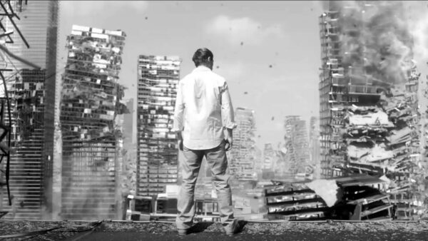
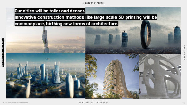
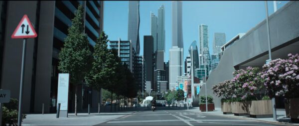
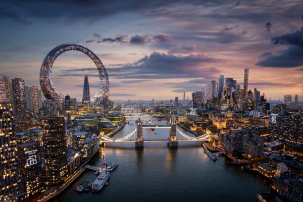
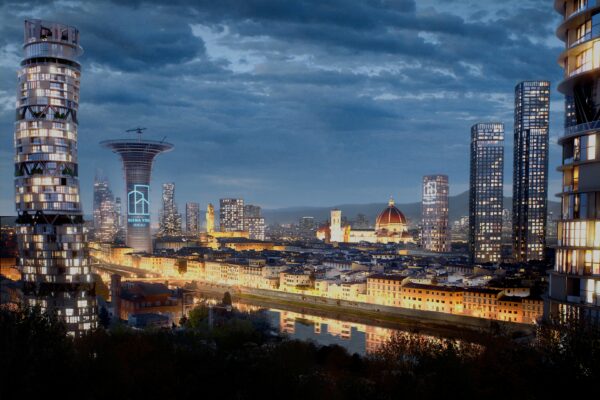
By contrast the city buildings were designed in mind of falling into the background as a natural continuation of Londons trajectory. En masse residential tower blocks with no notable features that could be copied and repeated as a pattern. Encroaching uniformity that the Kitchen sought to resist against.
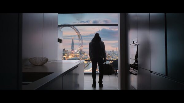
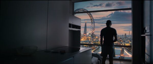
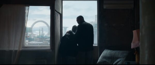
The more corporate glassy skyline buildings were given more dynamic silhouettes to play with the existing skyline forms. Cutting and shaping them at angles in nods to maximising available footprints that St Pauls viewing corridors restricts. Our hero building, lovingly dubbed “The Doughnut” as all good London Buildings should have a nickname, ever present in the view from Izi’s apartment, dominant as an anchor point and location reference within shots to tie them together.
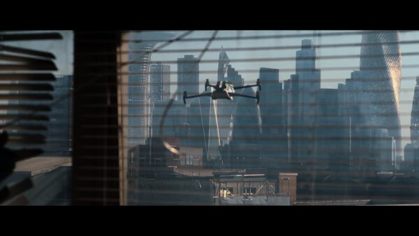
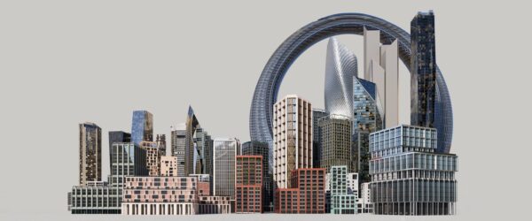
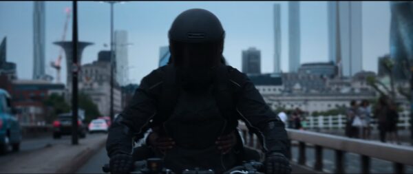
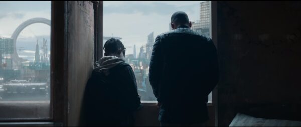
There is, too, a brilliant, striking design choice in the London skyline that the characters gaze at, with a gigantic, loop-shaped skyscraper that towers over the Shard. The contrast between its hyper-modernity and the fact that The Kitchen’s residents bang rusty old pots and pans out of the windows in unison when the police turn up to evict them – in this future all social housing has been eradicated – is smart.
The Evening Standard
The Market
The Market
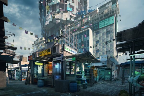
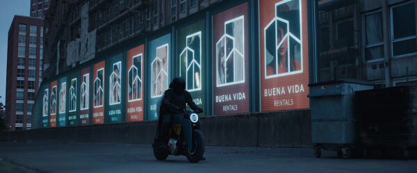
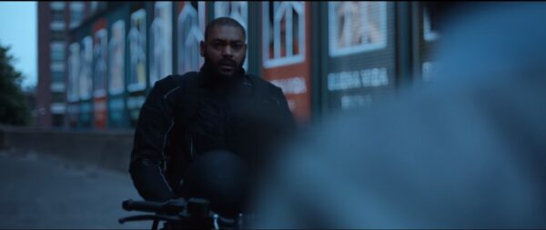
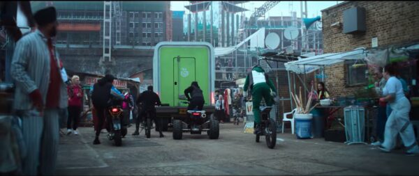
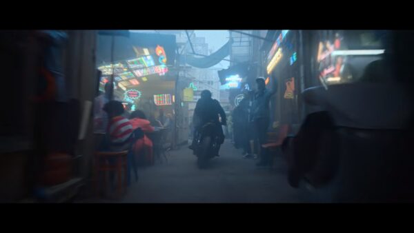
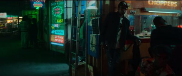
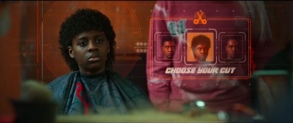
The market, the melting pot of the kitchen. Different cultures and cuisines coming together. Makeshift ramshackle contructions out of found objects and repurposed construction materials. The advertising is almost overwhelming but decidely low tech or “shit tech”. Neons and holograms add colour in contrast to the stark central city, however the messaging here is still on the desire for quick money, payday loans and offers promises of gambling and crypto currencies.
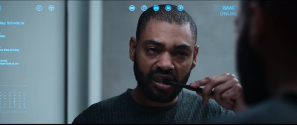
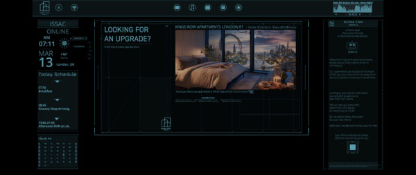
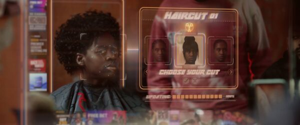
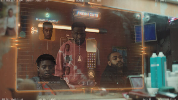
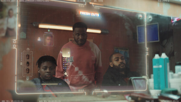
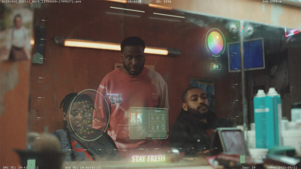
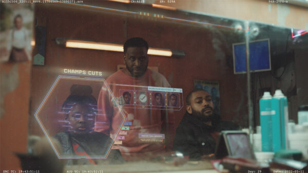
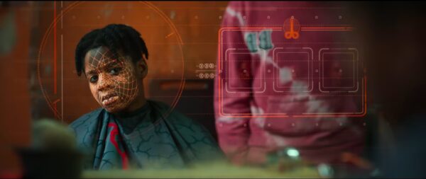
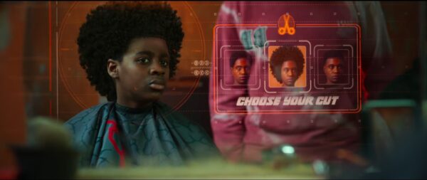
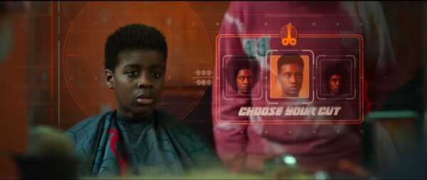
Here we created a series of 2D and 3D designs for the market, key assets being the digital horse racing gambling and concept for the barbershop UI. Testing different integrations for how the embedded mirror display could function and track Benji, taking references from video game character selection/creation screens and utilising metahuman as a base for Benji’s Icon double.
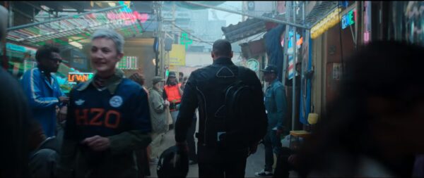
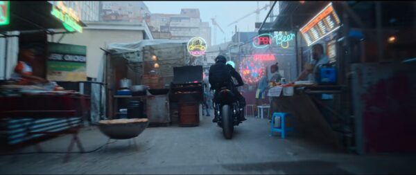
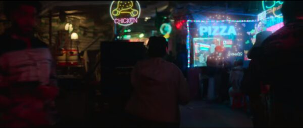
The future onscreen feels prescient. The skyline has shifted and the technology is new, but the residents of the Kitchen live in a knife’s edge version of London that could exist a few decades down the road. The world-building, particularly the production design by Nathan Parker, is strong and immersive, retaining a sense of grit that owes a debt to classics like Blade Runner or Total Recall.
Observer
The Boundary
The liminal space inbetween.
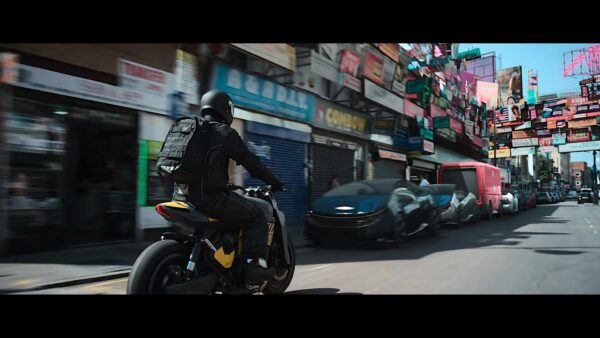
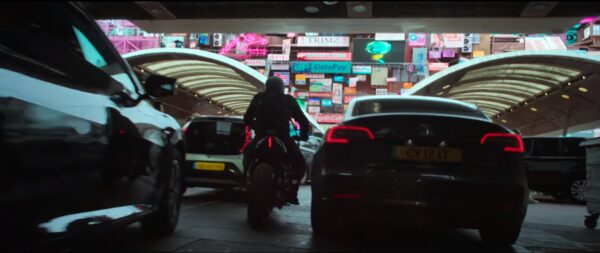
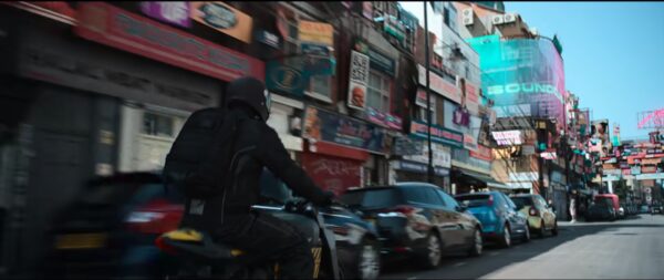
The hyper advertising of the market carries through here, spillover from the wider Kitchen population. The train tracks delineating the rich from the poor. High density, low income on one side, wide pavements, glassy towers and manicured planting the other.
Transport
Transport
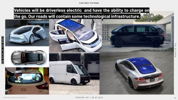
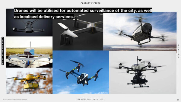
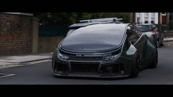
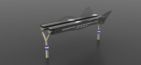
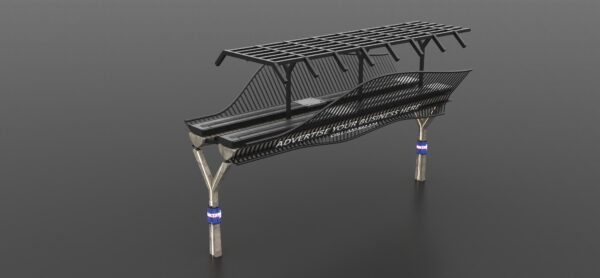
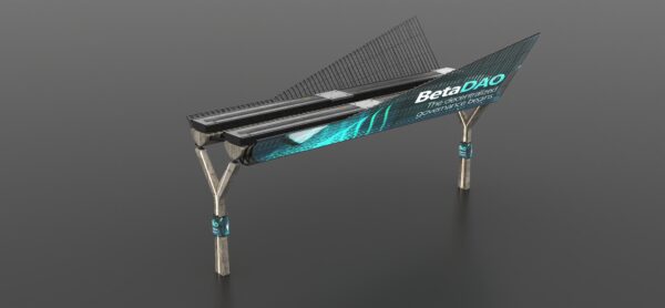
In the advancement of technology, the vehicles of tomorrow have been mandated as all electric within the centre. Cars are charged through embedded solar panels. Driverless trains and delivery vans move through the city as mobile pickup spots. Londons surveillance state symbol exemplified by the ever watching presence of their new police drones, ever harrying the residents of The Kitchen.

Life After Life
Earth to Earth. Roots to Roots. Life to Life.
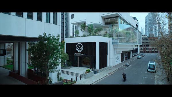
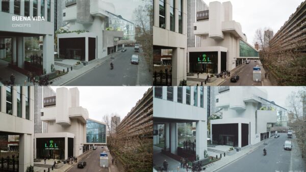
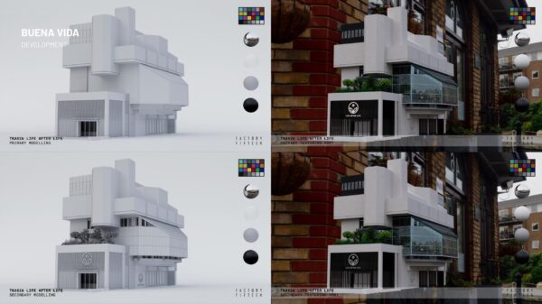
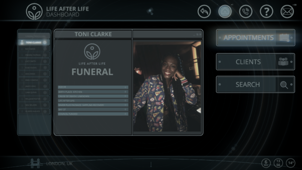
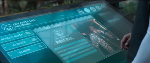
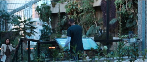
Answering what the jobs of tomorrow could be, we examined the idea of increasing instability in the Worlds biodiversity and how this could inform what roles are created in response to this. The centre of London is attempting to preserve and expand upon regreening the centre and across parts of the UK, utilising fertile soil created from the part state funded cremation of the population otherwise unable to afford a more traditional burial. Designing a modern greenhouse extension to an existing location allowing the greenery to be clearly visible, referencing the function of the building from the outside. Inside, we focused on the UI interface Izi uses to access his daily tasks at work, keeping the same minimal clean language of the building through to the interface design.

...when you look at that worldbuilding, it does have an architectural eye, you create new worlds by taking worlds that exist and building the future on top of them. So I thought it was impressive.
Credits
Client/Legal
Netflix©2024
